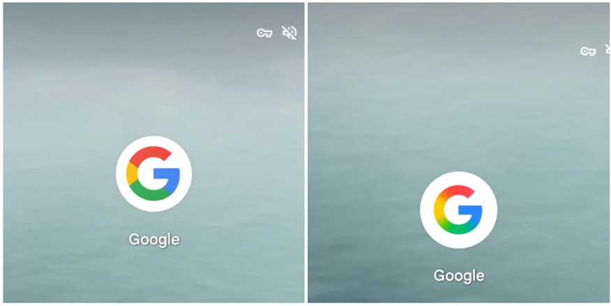
Google has unveiled a significant update to its iconic ‘G’ logo, transitioning from a solid colour design to a more modern gradient style. This is the first major update since 2015, reflecting the company’s evolving design language and its push toward more dynamic visuals in its branding.
About the Updated Google Logo
The refreshed ‘G’ icon now features a smooth gradient transition where the colours blend seamlessly, creating a fluid, modern aesthetic. Previously, each colour—blue, green, yellow, and red—was clearly segmented into blocks with defined boundaries. Now, these colours gently fade into one another, enhancing the logo’s sleek, contemporary look.
The change was first spotted on the Google Search app for iOS but has not yet rolled out on Android devices. The updated icon matches the design trend set by some of Google’s newer products, such as Gemini, which also uses a gradient colour palette. This visual shift brings the company’s branding more in line with current design trends, which favour fluidity and subtle transitions over harsh boundaries.
The Impact of Google’s Logo Update
While the update is significant for the company’s branding, it’s important to note that the six-letter ‘GOOGLE’ logo has not changed. It retains the same solid colour typeface introduced in 2015, which uses the same four colours in its design. However, the updated ‘G’ logo now gives a more dynamic first impression to users, aligning with Google’s modern tech solutions.
For a company like Google, maintaining a modern and consistent visual identity is crucial. As the tech giant continues to innovate and expand, this logo update helps signal the shift toward more advanced, integrated technologies like artificial intelligence and Web3. The gradient design also ties in well with Google’s growing use of gradients in its products, such as in the experimental AI Mode on Google Search, which also features a gradient design using the company’s primary colours.

This update shows that Google is actively adapting its branding to stay relevant in an increasingly competitive tech space. By updating its ‘G’ logo, the company is reinforcing its commitment to continuous improvement in both technology and design.
What’s Next for Google’s Branding?
With more products adopting gradient designs, we may see further visual updates to Google’s other logos and user interfaces in the future. This change to the ‘G’ logo might be a precursor to more significant shifts in how Google presents its identity across the digital landscape.
Stay tuned for more updates as we continue to follow how Google is reshaping its brand and integrating new design philosophies into its products. If you’re interested in learning more about Google’s design trends and branding strategies, check out our previous article on Google’s Icon History and Evolution.
Conclusion
The introduction of a gradient design for Google’s ‘G’ icon in 2025 marks an exciting evolution in the company’s branding strategy. By blending its colours instead of keeping them separate, Google has created a fresher, more fluid visual identity that matches its cutting-edge technology. As Google continues to innovate, we can expect its logo and brand identity to evolve even further, keeping up with trends and maintaining its position as a leader in the tech industry.
What do you think of the new Google logo design? Share your thoughts with us in the comments below!